
Tatiana Ochoa · Product Designer

I designend‑to‑end productsfor and with AI.

Now at Codebranch, working with NVIDIA.


user‑attributed sales lift, Zubale
+18.5%
years designing · 4 in product, 10 in architecture
14

Selected projects

Work I'm proud of

A selection of projects across industries, from conversational commerce to AI-powered real estate.

Bancolombia

Cross-border transfers

Who receives it, how much lands, when it landed.
Design challenge · 4 days

Fintech · Cross-border transfers

Bancolombia: who receives it, how much lands, when it landed

A four-day design challenge for Bancolombia's Experience Design team, judged by that team. I audited the live app before drawing a single screen, and designed one product for both directions when the brief let me pick just one.


4
days, Friday to Monday
24
screens · both directions, one product
RoleSole designer
FormatSelection challenge, judged by the team
Time box4 days, Aug 2026
DeliveredFigma: 15 process boards, 24 screens, 32 components

The brief

Four days, a real panel, and a choice I did not take

Design the experience of moving money between an account in Colombia and one abroad. The brief let me pick one direction and one channel. I took both directions in a single product, on mobile, because the direction is a parameter and not a different product. What the panel was assessing was not the perfect solution. It was how I analyse, how I decide, how I use AI and how I document.

Assumptions

What I bet, before showing anything

The assumptions go first because the brief asks for them first, and because whoever is assessing deserves to know what ground I am standing on before they see a screen. One product for both directions. The flow forks late. The lead number is what lands, not what leaves. More transparency is not always better, so the breakdown lives one tap away. The wait cannot be sped up from design, so it gets made legible instead.

Starting point

I went into the product before writing a problem

I used the app and the web branch as if the project had landed on my desk that morning, with my own timestamped captures. Sending has one path and only two countries: the entry is called "Send money to Panama or Puerto Rico", named after where the bank has a subsidiary, and tapping it asks you to open a dollar account first. Receiving does exist, and I got this one wrong at first. It sits under Transactions, with automatic crediting already on. It shares three details and leaves out the two without which no transfer can be sent: the SWIFT code and the account holder's name.
Receiving money, in the bank's own words: enjoy an easier experience from your computer.
Below it, the history of what you received, cut off at the edge of the screen and empty.

On the Saturday my own audit said the opposite: that receiving from abroad was an empty table with no action on it. I went back into the app on Sunday, found the screen, and corrected the audit in the three places where it was wrong. The framing did not get weaker for it. The missing screen is not the one nobody designs. It is the one that exists and is incomplete.

The problem

The bank already knows how to accompany a transfer. It does it inside Colombia.

Who receives itWith Bre-B, inside ColombiaIt shows you the account holder's name before you confirm.Across the border, todayI check the details myself, digit by digit.
How much landsWith Bre-B, inside ColombiaThe exact amount arrives, at no cost.Across the border, todayHow much actually landed, I find out once it has landed.
When it landedWith Bre-B, inside ColombiaTwenty seconds, and it tells you.Across the border, todayThe confirmation comes from the other person, over WhatsApp.

What I take from Bre-B is the experience, not the rail. The transfer still goes over SWIFT, with its days and its costs, so I cannot promise free and I cannot promise instant. What I can do is make the app answer. They are the same three questions whether you send or receive. What changes is who starts.

How I got there

Three statements I threw out first

01
Opaque costs plus paperwork as the friction. The interviews knocked it down. With the purpose asked in plain language nobody reported friction, and cost opacity never came up as a spontaneous complaint.
02
People do not think about remittances, they think about moving money. True, and it described a transfer between two local accounts just as well. A statement that fits everything points at nothing.
03
International is irreversible, domestic can be undone. As a user it did not add up: I have never been able to undo a local transfer. I checked it against a source and dropped it.

Research

Five interviews, ten patterns, five that changed the design

Fifteen minutes each: two people who send, three who receive. One of the three is me, and I declare it as insider data rather than neutral evidence. At n=5 these are hypotheses with evidence behind them, not validated findings.
01
The close. Two of four had certainty inside the channel and went looking for confirmation outside it anyway. The artefact that closes the loop is a screenshot, and no product designs it.
02
Costs. Showing is not teaching. The person who was shown the number does not remember it. The person who was told what the charge was for learned it. That corrected a principle I had already written.
03
The deadline. Three business days to move the dollars or they go back to the sender, with no word on which time zone rules or which holidays count. One interviewee works it out by hand.
04
Verification. Checking the routing number four times against a WhatsApp message is a person covering a job the system does not do.
05
What ties it together. The work starts before the app opens and ends after it closes. The product only designs the middle piece.

Three things the evidence does not support, and I said so in the file. Paperwork is not the pain when the purpose is asked in human language, although the raw regulatory code in a dropdown is. Nobody lost money, so I do not claim people lose money. I claim they behave as if they could. And one of my own questions failed, because it used my vocabulary instead of theirs.

Two archetypes

Daniel sends. Mariana collects.

Daniel, 42, sends to a third party

Mariana, 38, collects from abroad

His question is whether he is sending to the right person. The details reach him over WhatsApp, he checks them digit by digit, and he closes with a screenshot.
Her questions are when it lands, what is left after the rate, and how long she has to decide what to do with it. Today she asks the sender when they sent it.

Mariana was badly built at first: her problem came from a single interview and was presented as the problem of all three people who receive. I rebuilt her on the pattern that is three out of three, that the exchange rate governs the income and there is no visibility forwards or backwards. What one person said did not make it into the archetype.

Benchmark

The advantage nobody is communicating

Seven references. I started with nine and dropped two, because what they added was already covered elsewhere in the file. Comparing what it costs to receive foreign currency produced the finding that set the tone of the whole case.
Bancolombia
No commission for receivingCorrespondent banks can still charge, and the bank's own site says so.
BBVA
About USD 20 to the recipientPlus an administrative charge in pesos.
Davivienda
USD 12 digital, up to USD 20 in branchSources differ slightly, so it goes in as a range and not as an exact figure.
Banco de Bogotá
Not available to individualsSWIFT into corporate accounts only.
Public tariff pages, checked in August 2026. Bancolombia's sending fees have no current public figure, so they are not used anywhere in this case.

The proposal does not fix a broken product. It makes visible an advantage that is currently buried.

Arq treats pesos, dollars, euros and crypto as rows of one list. Direction is already a parameter there.
Nu hands you your key with a copy button, and only inside Colombia.

The decision

Two entrances, one task, three points of divergence

One product in both directions: accounts, amount, details, confirm, tracking. Sending, the first question carries the weight. Receiving, the second and the third do. From Home there is an entry named after the task, Money with abroad, which opens the hub with both directions. From the Transfer menu that already exists there is one more row, Transfer abroad, for whoever has already decided to send.
01
The entry point. The user starts it, or a transfer already on its way starts it.
02
The destination details. SWIFT, ABA or IBAN depending on the country, against an account of your own that is already registered.
03
The paperwork. You pick the purpose before confirming and the declaration generates itself, against confirming a purpose already saved while the bank legalises and credits.

The risk is written on the board itself: unifying is harder to design and easier to criticise than picking one lane. What lands is the lead number and what you send is secondary. The rate shows the official reference beside it so the margin is visible. Deadlines are stated with a date and a time, never in business days.

The send flow, twelve screens, 28 seconds. It ends where the case ends: on the receipt and the confirmation.

The screens

The missing screen, and the money made legible

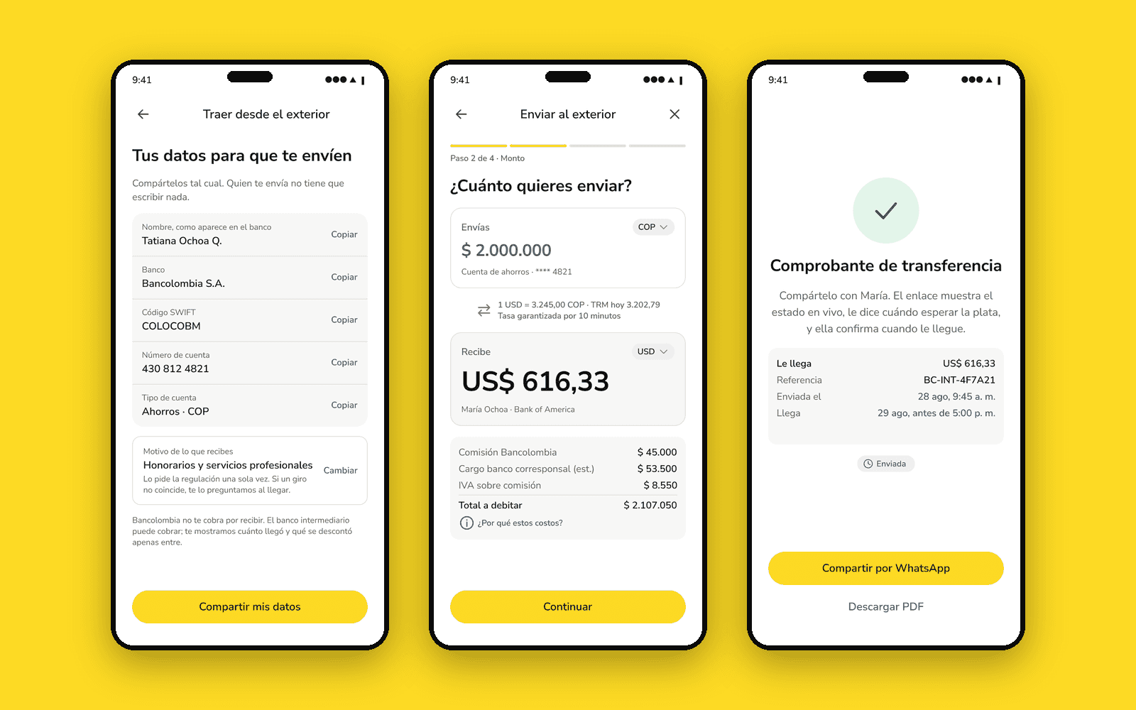
Before any transfer: your details so they can pay you. Name as it appears at the bank, bank, SWIFT, account and type, each one with copy, and one button to share the block. The purpose is configured once, on top of the automatic crediting the app already has. It is not a screen that does not exist. It exists and it is incomplete, sharing three of the five details that are actually needed.
B0. The five details, each one copyable, in one share. Fictitious account data.
A2. What lands is the lead number, with the official rate beside it and the rate held for ten minutes.
A4. The full breakdown before authorising. The peso figures are a declared hypothesis, not a published tariff.

Closing the loop

The decision I care about most, and the only one that comes straight out of research

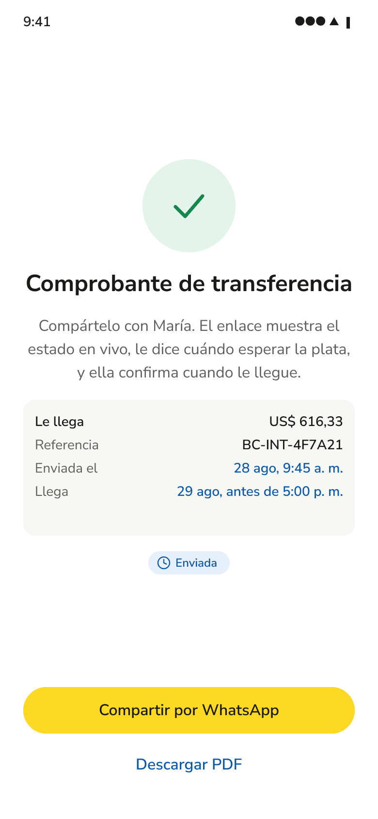
If the artefact that closes the loop is a screenshot over WhatsApp, then the flow does not end at "sent". So I designed the two steps that were missing: a shareable receipt with live status, carrying the one row a screenshot never has, when it lands. And the final state, confirmed by the person receiving.
A8. The screenshot, designed. It says when the money lands.
A9. The loop closed, from the other side.

The move from A8 to A9 is not triggered by the sender. It is triggered by the other person, from the link. No competitor in the benchmark designs that close.

The only transition in the file executed by someone who is not the user

System and handoff

Contrast measured by script, not estimated by eye

92 variables across four collections with scopes and CSS syntax, 12 text styles, 32 components with usage notes, and zero loose hex values in the screens. The contrast figures come from a script run over the actual fills in the file. Colour never codes direction inside the screens: two colours read as equals would say these are two products, and that contradicts the thesis.
17.4:1
Primary text
6.5:1
Secondary text
6.9:1
Links and focus
92
Variables · 32 components

The handoff has two routes. The one I deliver here is Dev Mode, with per-screen annotations and data contracts. The other is a branch on the repo with the tokens as CSS variables, which I did not do because I have neither the repo nor the bank's real design system. The difference between the two is not the tool. It is where the source of truth lives.

How I used AI

AI proposes, I verify and decide

Two Claudes with different jobs: one to think out loud about context, interviews and framing, and one to build on the Figma file over MCP. One to doubt with, the other to execute. Friday and Saturday the pattern ran in that order, three times.

The tool proposed

I verified

Mobile as the channel.
I went into the channel and confirmed it.
A first version of the problem: international is irreversible, domestic is not.
It did not match my own experience. I checked it against a source and dropped it.
That international transfers did not exist in the app.
I went in. It did exist. The claim was false and the finding got better.

On Sunday it ran the other way, and that is the part worth telling.

I proposed

The reviewer pushed back

24 screens I had read many times and considered finished.
A reviewer agent read them as the panel would and found an impossible error scenario, a screen contradicting itself on dates, and an account that did not match the rest of the flow.
A fourth question added to the problem.
It argued against me using my own research. I took the argument.

The rule holds in both directions: framing and judgement are not delegated, and verification runs both ways. I also designed for AI inside the product, which is a different thing: autofill the beneficiary details from a photo, check that the ABA and the bank agree, suggest the purpose from history. Always with the person reviewing before anything continues.

What I did not verify

Declaring it adds. Hiding it takes away.

  • I did not open a dollar account for a design exercise, so the send flow beyond the requirement page is still an assumption.
  • I did not see what the app does when a transfer actually arrives. I saw the settings screen, not a crediting.
  • I did not audit the desktop version of the web branch, or the BBVA and Davivienda flows.
  • n=5, all from Medellín, all highly digitally literate, and one of them is the designer.
  • No interviewee lost money. The fear is documented. The failure did not occur in the sample.
  • That the currency paperwork can be resolved inside the app is a declared assumption, and the first question I would ask the team.
  • Two opportunities are declared and deliberately out of scope: keeping the money in the currency it arrived in, and the rate on recurring collections.

What I take from it

The thing that paid off most was not a screen. It was going into the channel before writing the problem, going back in once the file was already built, finding that I had got it wrong, and correcting it in the three places where it was wrong.
NVIDIA
Protected by NDA

Enterprise · Supply-chain AI

NVIDIA: from spreadsheets to a live supply model

Replaced offline spreadsheet guesswork with a live model NVIDIA leadership takes straight into tradeoff conversations. R1 shipped, R2 finalizing. The hard part was making four simultaneous constraints legible on one screen.


3
releases · R1 live
4
simultaneous constraints modeled
RoleLead Product Designer
Releases3 · R1 live · R2 finalizing · R3 scoping
TeamPM · PO · Front Eng · QA · AI · Ops users · NVIDIA back‑end
StatusLive · Under NDA
Mock

Everything in this case is a mock. The product name, module names, product families, figures and dates were replaced with generic placeholders to respect the NDA. The structure and interactions are the ones I designed.

Three releases, one direction

The product grew by shedding assumptions, not adding features.

Each release redefined the ceiling of what the tool could model, and how much of the planning process it could own.
R1
Proved the concept. A single‑constraint model anchored to one upstream component supply. Replaced offline spreadsheet guesswork with a view leadership could put straight into a tradeoff conversation.
R2
Made it real. Four simultaneous constraints across several product families, plus an agentic onboarding workflow that compressed weeks of manual setup into a single guided session, with human approval at every gate.
R3
Makes it infrastructure. In scoping now. The vision: a platform that self‑onboards new products the moment they appear in the roadmap, runs baseline scenarios overnight, and briefs leadership before anyone asks.

What I designed

Four surfaces around one scenario.

The whole product orbits the scenario as the unit of work. Everything connects back to it. Module names below are generic.
01
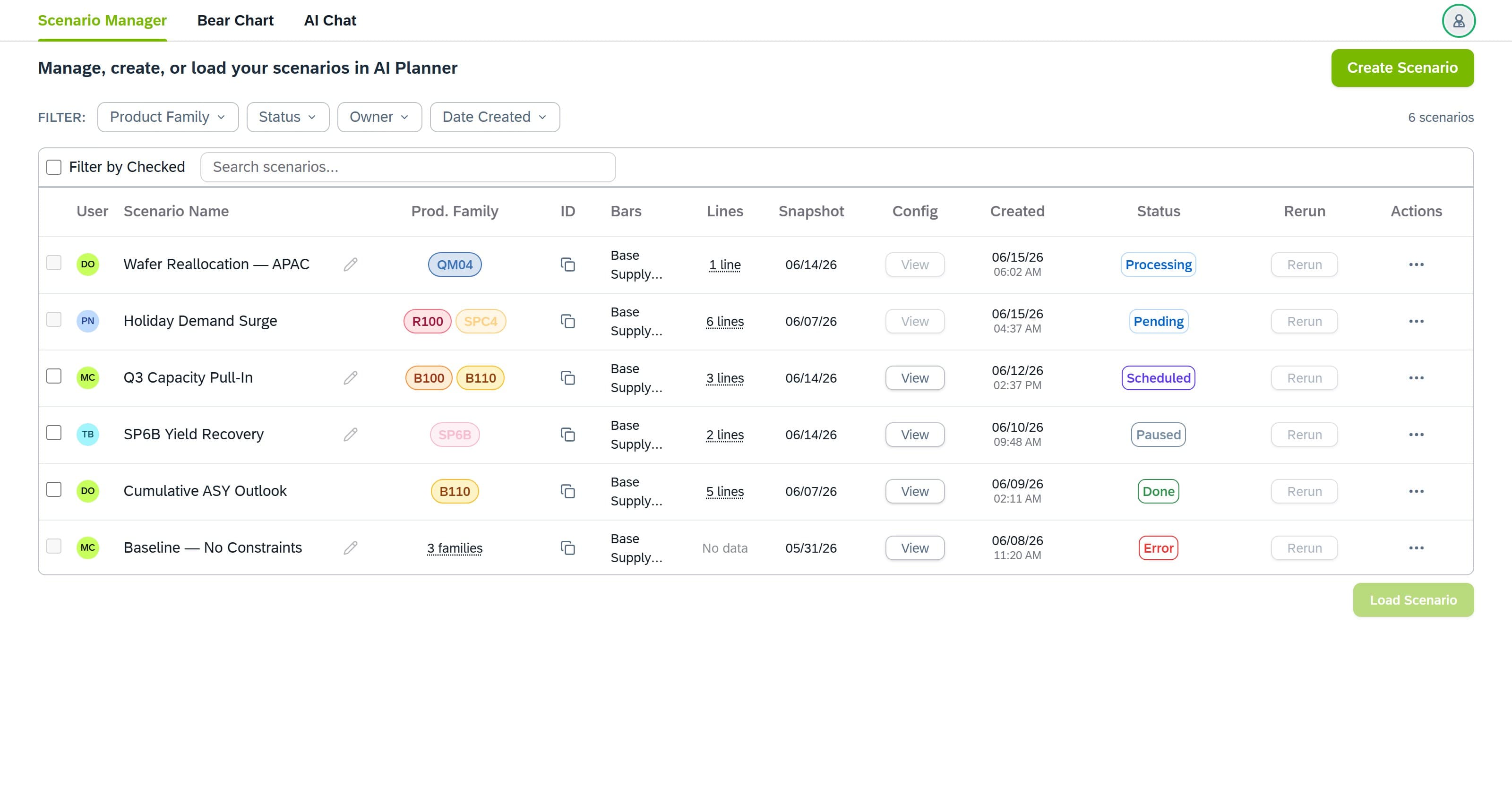
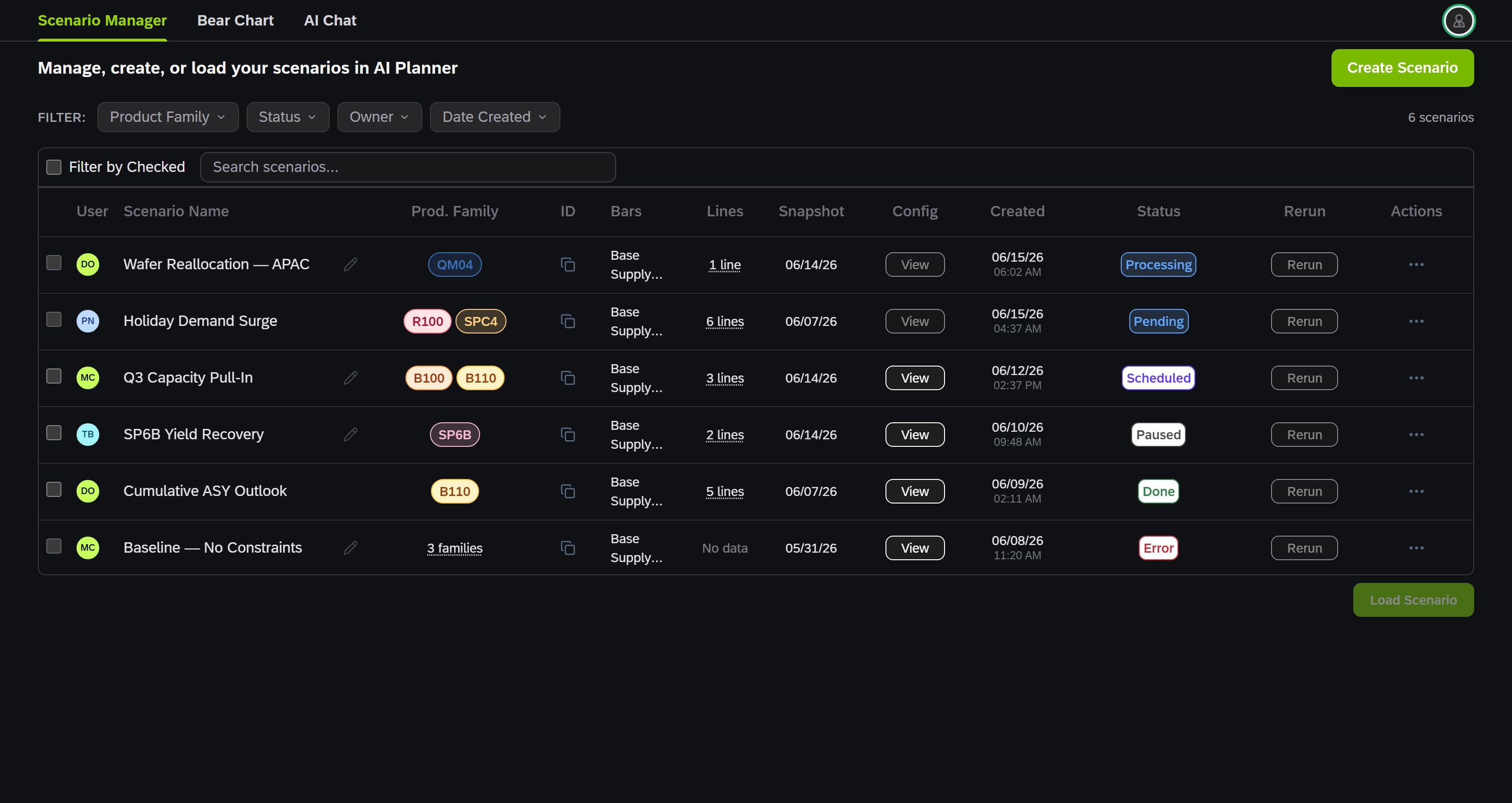
Scenario library. Overhauled in R2. Faceted filtering, sorting, favorites, bulk actions, cross‑user sharing, and double‑click‑to‑open. The entry surface for every planner session.
02
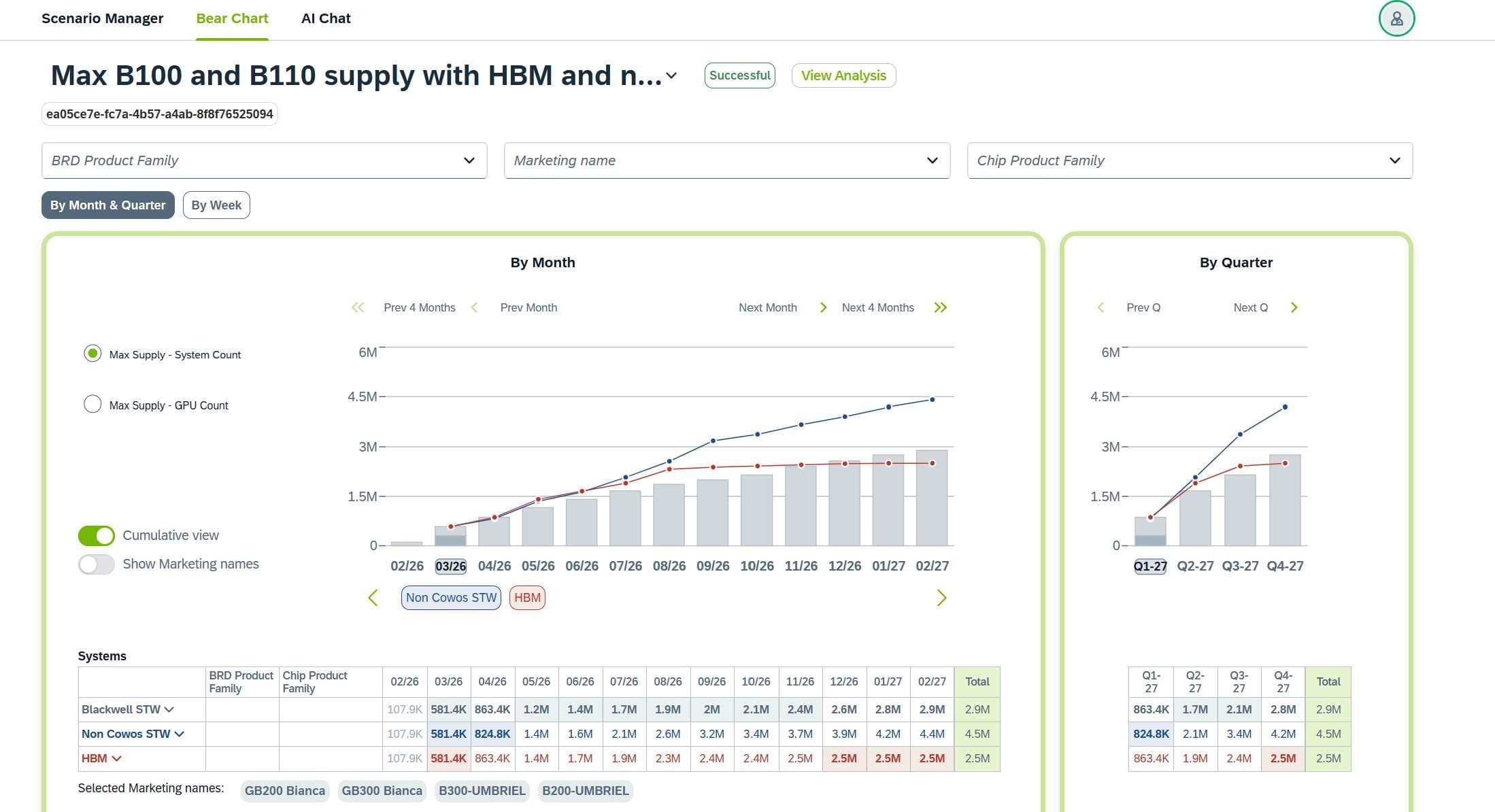
Constraint chart. The constraint‑driven visualization at the core of the dashboard. Grey bars show the maximum supply envelope; colored lines overlay each additional constraint. The limiter is readable at a glance. Series toggles, week/month/quarter selectors, and per‑family color management added in R2.
03
Scenario builder. A dense configuration platform for defining inputs, assumptions, and constraints. Designed to let ops users move fast without losing precision.
04
AI assistant. Interpretive layer scoped per scenario. The model already has the full scenario context, so nobody is copy‑pasting numbers into a generic assistant.
Scenario library mock: supply plans by product family, with status and snapshot per run. Names, codes and dates are placeholders.
Scenario library · mock data
Constraint chart mock: supply envelope with constraint lines overlaid by month and quarter. Product codes and figures are placeholders.
Constraint chart · supply envelope + constraint lines · month & quarter view · mock data

What I learned

The first version was the most ambitious. The shipped version is the most useful.

01
Reshape, don't protect. Earlier iterations were more robust than what's live today. Feedback kept shrinking the surface until what remained was what operators actually needed.
02
Busy users reward speed and clarity over depth. "Clever" lost to "clear" every time we tested. Dense tools need a fast entry point, not a gentle one.
03
Async-first is its own discipline. Three time zones forced every Figma frame to stand on its own, with no walkthrough to bail you out.
04
Releases compound differently than sprints. The biggest R2 wins came from watching real friction in R1 and designing against it, not from the next item on the backlog.

Current state · NDA

The real product name, screens, data flows and product family details are under NDA. What you see here is a mock built with generic names and placeholder data.

  • Walmart
  • Cashi
  • Decathlon
  • Subway
  • Pizza Hut
  • Sbarro
  • Hubii
  • Angeloni
  • Condor
  • Makro
  • Paris
  • Farmapronto
Case study

Conversational commerce · LATAM

Zubale: Consumer Connect

Lifted user‑attributed sales by up to 18.5% for Latin America's leading retail‑tech platform. The whole store lived inside WhatsApp, where one extra message costs a conversion, so the work was copy, sequencing and CRO, not screens.


+18.5%
user‑attributed sales lift
100+
retailers · 6 LATAM countries
RoleProduct Designer, Consumer Connect
TimelineOct 2023 to May 2025
TeamPM · Engineers · Data · Ops
StatusLive in 6 LATAM countries

The problem

Many retailers, six countries, one chat thread

Zubale needed a unified WhatsApp shopping experience that worked across 100+ potential retailers in 6 LATAM countries, without each retailer building their own conversational flow.

What I designed

Conversational flow patterns, copy systems, and conversion optimization

Redesigned cart, checkout, and post-purchase flows. Authored the UX writing voice + tone for all 6 markets. Iterated on conversion choke-points with A/B tests.

Outcomes

+18.5%
User‑attributed sales lift
100+
Potential retailers
6
LATAM countries
2yr
Tenure on Consumer Connect

Retailers shipped

Walmart
Cashi
Decathlon
Subway
Pizza Hut
Sbarro
Hubii
Angeloni
Condor
Makro
Paris
Farmapronto

AI marketing assistant

The insight that becomes an action.

Freelance project

AI · Marketing analytics

Adaly.ai: the insight that becomes an action

A freelance project for adaly.ai, an AI marketing assistant. I designed the dashboard and its chat, on desktop and mobile, around one loop: the assistant reads the campaigns, explains what it sees, and turns each insight into an automation rule in one tap.


1 tap
from insight to automation rule
8
hi-fi screens · desktop and mobile
RoleSole designer
Clientadaly.ai founder · freelance, 2024
ScopeDashboard + AI chat · desktop and mobile
DeliveredFigma, 2 rounds in 2 weeks: 8 hi-fi screens, 2 breakpoints. Shown here rebuilt in code.

The brief

Make AI accessible and actionable for marketers

Adaly.ai's promise is an AI assistant that makes marketing data usable by people who are not analysts. The brief asked for an intuitive interface for the platform: a dashboard that centralizes campaigns, insights and automations, and a chat that answers natural questions over that same data. I read "actionable" as the operative word, and designed everything around the moment an insight turns into a decision. I worked directly with the founder over two weeks, in two review rounds.

Who it is for

Two people who do not have time for dashboards

Rebeca runs marketing from home between two kids and a social life she refuses to lose; she is overwhelmed by data and dashboards. Carlos is an IT manager who automates everything he can because repetitive data work is where his week disappears. Neither of them wants a more powerful tool. They want fewer steps between a question and an answer, and between an answer and an action.

The dashboard

Everything answers to one question: how is it going today

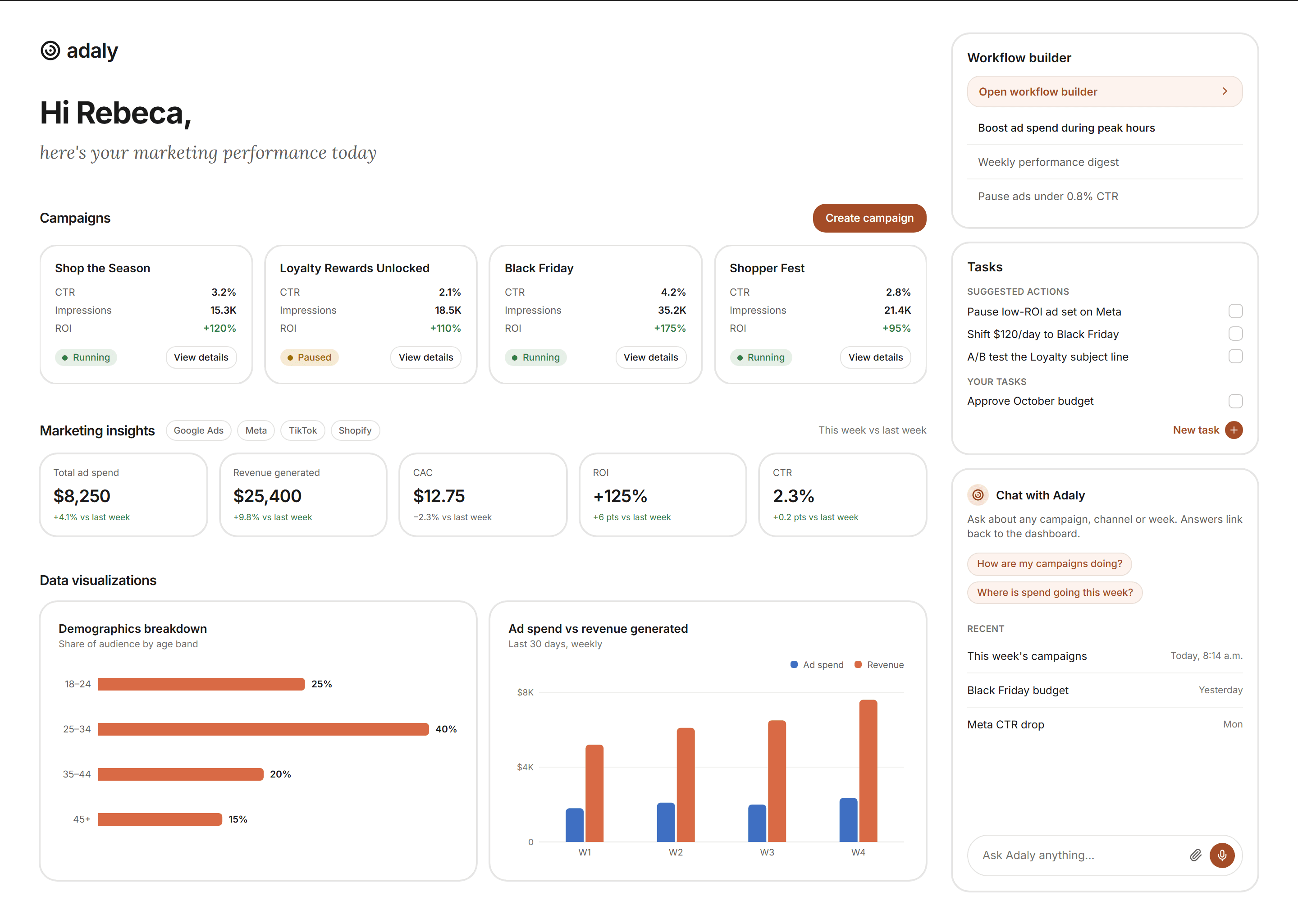
They do not have time to read a dashboard, so this one does the reading for them. Three ad platforms and the store feed one view. Campaigns lead with the three numbers the brief put first (CTR, impressions, ROI) and their state; the indicators row compares against last week; the charts sit below, already drawn. Automation lives on the same screen: a workflow builder, a task list where the assistant suggests actions, and the chat entry beside them. Nothing requires opening a second tool to act on what the first one showed.
The desktop dashboard. Campaigns, indicators vs last week, visualizations, workflow builder, suggested tasks and the chat entry, on one screen.
The same screen with the chat embedded: the conversation happens beside the data it talks about, not instead of it.

The chat loop

Ask, see, act: the whole loop inside one conversation

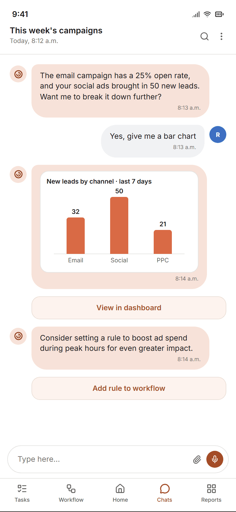
The conversation is designed as a loop, not a Q&A. You ask how the campaigns are doing and get an answer in plain language. You ask for a chart and get it drawn in the thread, with a link to the same chart in the dashboard. Then the assistant goes first: it suggests a rule (boost ad spend during peak hours), and the suggestion carries its own button. One tap adds it to the workflow, and the confirmation closes the loop in the same thread where it started.
The question in your own words, the answer in plain language.
A chart on request, a link into the dashboard, and a suggested rule.
One tap adds the rule to the workflow. The confirmation closes the loop.

The suggested rule is the design thesis in one component: the insight and the action share a bubble, so acting costs one tap instead of a context switch.

Decisions

Three decisions and what each one cost

01
Chat beside the data, not instead of it. On desktop the chat is a panel over the dashboard, so the chart it draws duplicates one already on screen. I kept the duplication: the answer has to live in the thread, or the thread stops being the record of the decision.
02
Three numbers per campaign, not eight. Each card shows CTR, impressions, ROI and a state. Spend, CPA and frequency went behind “View details”. People look at the card to decide whether to open it, not to run the campaign from it.
03
One tap was the brief; it is not where I would ship it. A rule that moves budget needs its parameters visible and an undo before the confirmation. The version I would build today puts a rule card (hours, amount, daily cap) between the suggestion and “Add”, and keeps the one tap for suggestions that do not spend money.

Outcome

Delivered in two rounds; the engagement ended at handoff

I handed off the Figma file to the founder in 2024 after the second review round. The engagement ended there and I did not follow the build, so I cannot claim an outcome for the product. What I would keep is the rule-in-a-bubble pattern; what I would change is decision 03. The screens on this page are those frames rebuilt in code in 2026, with the fixes from my own later audit: one metric per chart, a palette validated for contrast, and copy and data made consistent across breakpoints.

Designed for & with·NVIDIA · Zubale · Codebranch · Pari · Televisa · Walmart

How I work

Strategy, curation, AI, global

01

Strategy

I make the hard calls: what to build, what to cut, why it matters.

02

Curation

Every flow, every word, every interaction gets decided on purpose.

03

AI-Powered

Claude, Figma AI, prompt engineering. The tool proposes, I verify and decide.

04

Global

US, LATAM, worldwide teams. Multicultural collaboration is second nature.

Experience

Where I've been

May 2025 to now

Product Designer

Codebranch (US/Colombia)

Design studio with clients including NVIDIA. Leading product design for AI-powered sports apps, a real estate platform, and enterprise tools for NVIDIA Operations.

Claude CodeClaude DesignFigma
Oct 2023 to May 2025

Product Designer, Consumer Connect

Zubale

WhatsApp-based shopping flows for 100+ retailers across 6 LATAM countries. UX writing, CRO, and flow redesign that increased user‑attributed sales by up to 18.5%.

FigmaWhatsApp BusinessMeta
Jun 2023 to Dec 2023

Design Project Manager

Pari Delivery (Mexico)

Led the parallel redesign of three product surfaces as Pari pivoted from dark stores to public-facing retail: 15 stores across CDMX, Guadalajara & Querétaro; brand identity; and the customer app shipped to iOS & Android.

ArchitectureBrand DirectionFigma
Previous career

Architect, Retail and Entertainment

Mexico City & Colombia

50+ retail stores across 5 countries. TV sets for Televisa. 15+ public projects in CDMX including PILARES schools.

AutoCADSketchUpRevit

Tools & skills

What I work with

Design & AI

FigmaClaude CodeClaude DesignAdobe Suite

Languages

English (C1, IELTS certified)Spanish (native)Portuguese (basic)Chinese (basic)

Get in touch

Let's build something together

Currently open to remote product design roles. Let's talk about what I can bring to your team.